- Insaid
- Building a brand system for a new era of nutrition, inclusive health and development. Strategic brand system, visual identity redesign, communication ecosystem and digital architecture.
System Areas
- Branding | Design | Communication | Marketing Technology | Growth
The Context
INSAID — Instituto de Nutrición, Salud Incluyente y Desarrollo — was born from the evolution of Nutriológicas, a project that had already built a strong community around nutrition education, eating disorders, body respect and professional training.
As the institution expanded, the brand needed to evolve as well.
The challenge was clear: transform a growing educational and health-centered project into a more mature, inclusive and scalable brand system.
INSAID needed an identity capable of holding science, care, body diversity, education and social awareness within one coherent universe.
The System We Built
We approached INSAID as a living brand ecosystem.
The goal was not only to redesign a visual identity, but to build a system capable of supporting courses, certifications, educational content, campaigns, social media, digital platforms and community-building.
Our work included:
- Brand evolution from Nutriológicas to INSAID
- Visual identity redesign
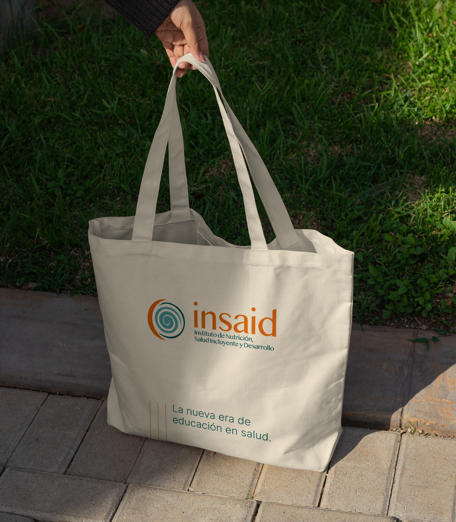
- Logo system and institutional lockups
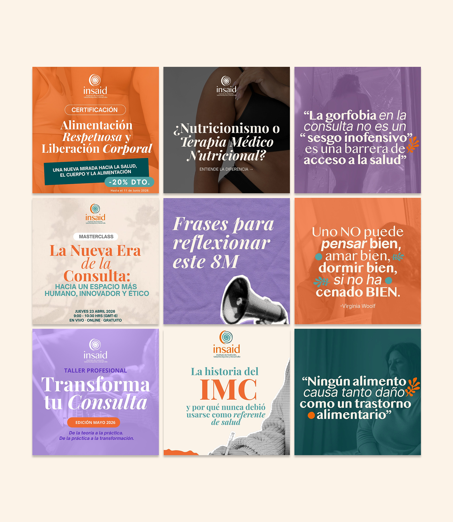
- Color palette and visual territory
- Typography system
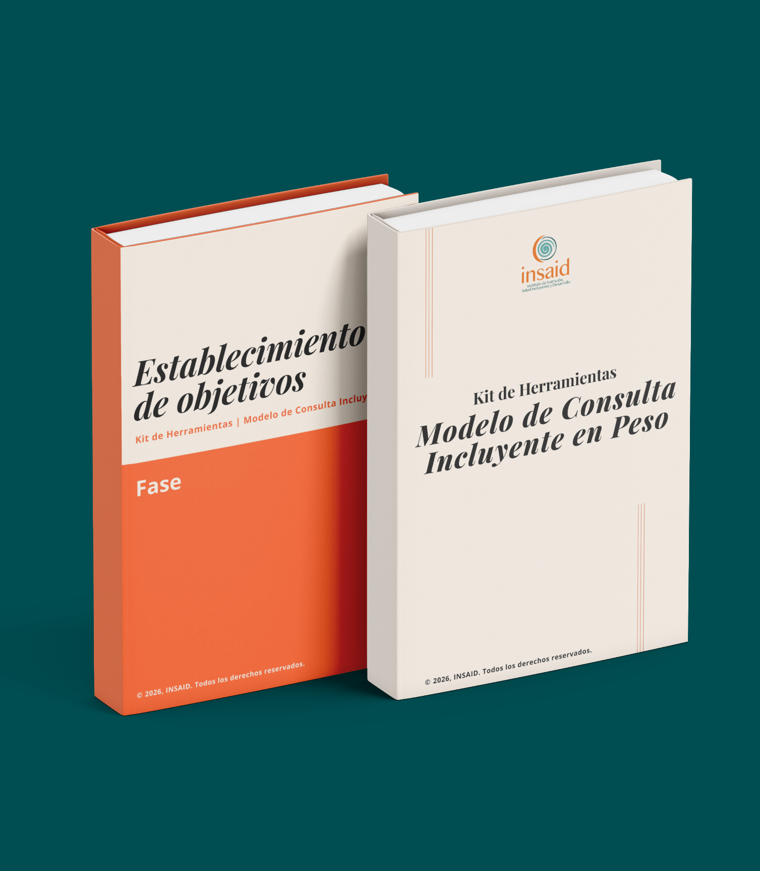
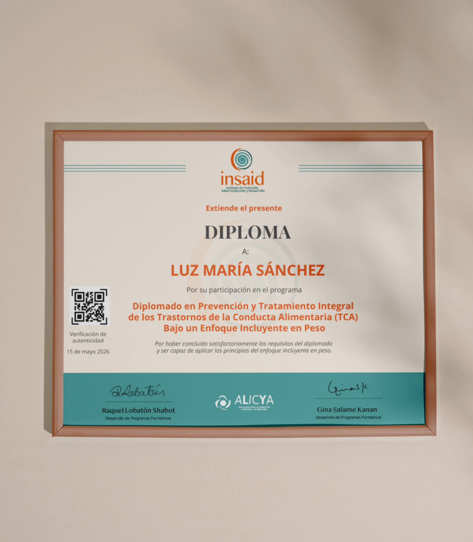
- Brand applications
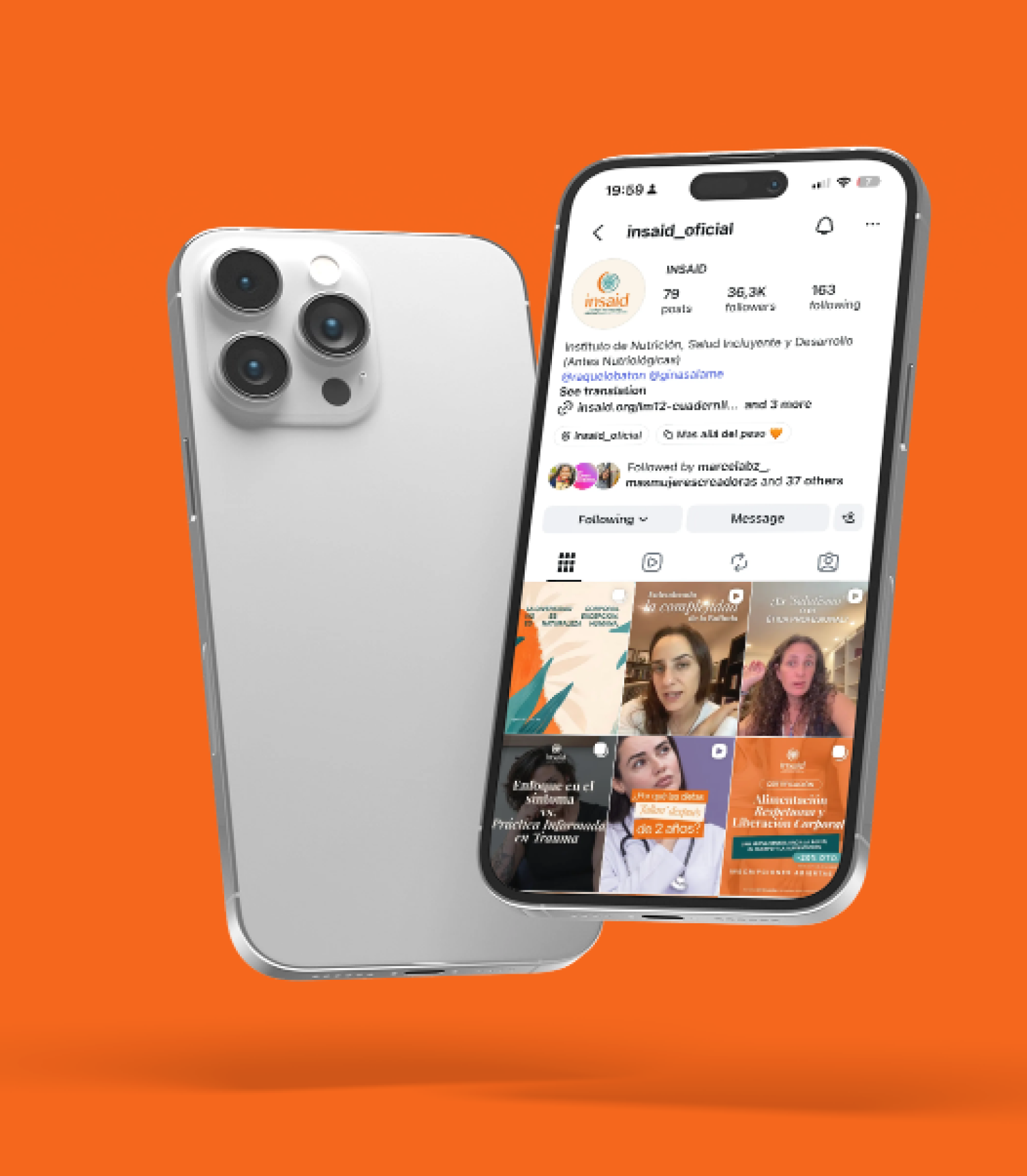
- Strategic social media structure
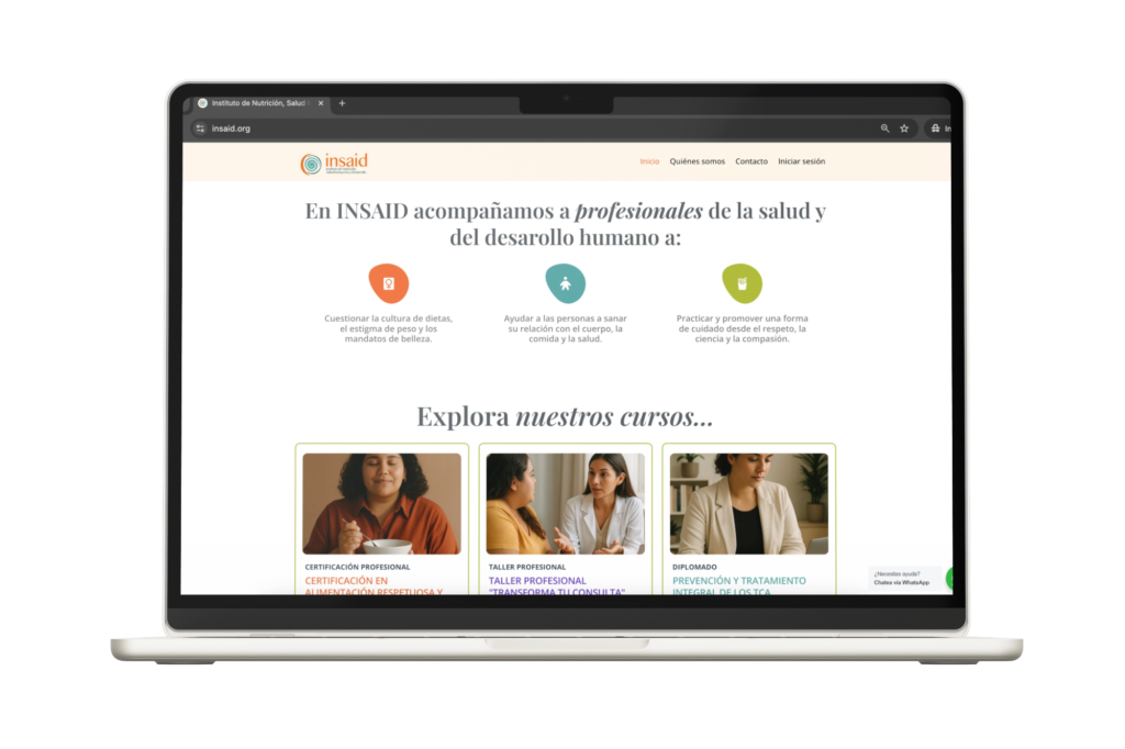
- Website redesign & Landing page architecture
- Email marketing support & Launch communication
- Content system for education and awareness
- Strategic narrative for courses and certifications
The Vision
INSAID needed to feel like an institution with depth, sensitivity and professional credibility.
The visual and narrative direction was built around a central idea:
A new era of nutrition, inclusive health and development.
From there, the brand territory expanded into concepts such as body diversity, skin, care, human contact, inclusion, softness, community and the body as a living territory.
Every decision — from color and typography to imagery and digital experience — was guided by the intention of creating a less rigid, more human and more inclusive way of communicating health.
The Execution
The implementation extended across visual, digital and communication environments:
- A renewed identity system for a more mature institutional presence
- A visual language rooted in body, care, science and liberation
- Color architecture to differentiate emotional, educational and institutional communication
- Typography system for clarity, editorial depth and accessibility
- Website redesign to support educational programs and user journeys
- Landing pages for launches, courses and certifications
- Social media templates and communication structure
- Email marketing and nurturing content
- Strategic content for professional audiences and community growth
The result was a brand ecosystem where education, health, inclusion and body respect could coexist with clarity, sensitivity and strategic direction.
*Project Results
This project reflects our hybrid model: strategic consulting mindset + creative brand execution.
Through INSAID, we connected brand identity, content, education, digital experience and growth into one coherent system.
The Impact
By transforming Nutriológicas into INSAID, the project gained a broader institutional presence, a stronger educational identity and a more coherent communication ecosystem.
The new brand system allowed INSAID to speak with more clarity to professionals, students and communities interested in nutrition, body respect, inclusive health and human development.
What was once perceived as a specialized educational project became a broader institutional platform designed for growth, recognition and long-term evolution.